

- Latch Infinity
- Branding
A Logo Is Not a Brand: What Goes Inside a Real Brand Book
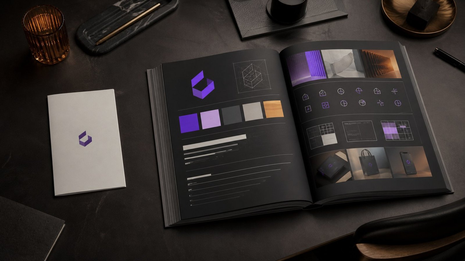
There is a specific PDF that has been emailed to every designer, printer, agency and intern in your organisation. It’s eight pages. It contains the logo, the logo in white, the logo in black, a rule about minimum clear space, two hex codes, and a page nobly titled “Incorrect Usage” featuring the logo stretched and rotated as a warning to others.
It is called the Brand Guidelines. It is a logo sheet in a nice suit.
You can tell it’s a logo sheet because of what happens next. Someone needs to design a recruitment ad, and the document has nothing to say. Someone writes a product email and invents a tone of voice on the spot. Someone builds a landing page and picks a button colour that appears nowhere in the palette because the palette has two colours and neither works as a button. Within eighteen months the brand looks like six brands in a trench coat.
A real brand book prevents this. Here’s what’s in one.
1. The strategy the identity is built on
Every visual decision should be traceable to something non-visual. Without this section, the brand book is a set of aesthetic preferences that any confident person can override in a meeting.
At minimum:
• Purpose - why the organisation exists beyond revenue • Positioning - the specific space you occupy relative to competitors, in one
uncomfortable sentence • Audience - who you’re for, and, more usefully, who you’re not for • Personality - three to five traits, each with an explicit opposite pole (“confident, but
not arrogant”) • Promise - what the customer can reliably expect every time
This section is short - usually four to six pages - and it’s the part that settles arguments. When someone asks “should we do a Diwali post?”, the answer comes from here, not from taste.
2. The logo system (not the logo)
A brand does not have a logo. It has a logo system: a primary lockup, a horizontal variant, a stacked variant, a symbol-only mark for small applications, and a favicon that survives being 16 pixels wide.
For each, the book specifies minimum size, clear space, approved colour treatments, and - crucially - which context uses which. “Use the stacked lockup when the available width is under 200px” is a useful instruction. “Don’t distort the logo” is not; nobody has ever distorted a logo on purpose.
Also here: co-branding rules. How your mark sits beside a partner’s, a client’s, a certification body’s. This page gets used far more than anyone expects and is missing from almost every brand book we’re shown.
3. A colour system that survives contact with reality
Two hex codes is not a colour system. A working palette has:
• Primary colours with values for every space - HEX, RGB, CMYK, Pantone, and RAL if you produce anything physical
• Secondary and accent colours with defined proportions (“primary 60%, secondary 30%, accent 10%”)
• Functional colours - success, warning, error, information - because your product interface needs them and will otherwise invent them
• Neutrals - a proper greyscale ramp, typically five to seven steps • Accessibility pairings - which text colours pass WCAG AA on which backgrounds,
stated explicitly
That last one is where most brand books collapse. A gorgeous light-grey-on-white combination that fails contrast standards will either be used and exclude people, or quietly abandoned in favour of something off-brand. Test the pairings and publish the results.
4. Typography with actual hierarchy
Naming two typefaces isn’t typography. The book needs a type scale - display, H1 through H4, body, caption, legal - with sizes, weights, line heights and letter spacing for each, specified for both print and screen.
It also needs licensing information (who owns the licence, how many seats, what the web font licence permits) and a documented fallback stack for when the licensed font isn’t available - in an email client, in a Word template, on a partner’s system. Without a sanctioned fallback, people pick their own. Usually Calibri. Sometimes worse.
5. Photography and image direction
The single most-ignored section, and the one that does the most damage when it’s missing. Two organisations with identical logos and palettes can look entirely different based on imagery alone.
Specify subject matter and situations, composition style, colour treatment and grade, lighting approach, the treatment of people (candid or posed, looking at camera or away), what’s explicitly off-limits - and, most valuably, a mood board of ten approved reference
images alongside ten rejected ones with reasons. Designers learn more from the rejections than from the rules.
6. Iconography, graphics and the supporting kit
The visual elements that appear everywhere and get invented separately in every department: icon style (line weight, corner radius, grid), illustration approach, patterns and textures, data visualisation styling, and the shape language that makes a layout recognisably yours even with the logo removed.
That last test is a genuinely good one. Cover the logo. Is it still obviously you? If not, the identity is doing less work than you think.
7. Voice and tone
Half of what your brand puts into the world is words, and most brand books ignore them entirely.
This section covers writing principles, vocabulary (terms you use, terms you avoid, how you refer to your own products), grammar and mechanics decisions - Oxford comma, sentence case or title case, UK or US English, date and number formats - and, most usefully, tone modulation: how the voice shifts between a celebratory announcement, an error message, a legal notice and a service outage.
Include worked examples. A rewritten paragraph teaches more than a page of adjectives.
8. Applications
Templates and worked examples for the things you actually produce: business cards, letterheads, email signatures, presentation decks, social templates per platform, ad formats, packaging, signage, vehicle livery, uniforms, exhibition stands.
This is what converts a brand book from a document people admire into a system people use. The best brand books ship with the working files attached.
9. Governance
The unglamorous part that determines whether any of it survives. Who owns the brand. Who approves exceptions. Where the assets live. How often the book is reviewed. What the process is when someone needs something the book doesn’t cover - because that will happen within the first month.
A brand book without a named owner degrades quietly. Within two years there are four versions of the logo in circulation and nobody remembers which is current.
How long this takes, and who needs to be in the room
Two practical questions that determine whether the book gets built properly or gets built twice.
Timeline. A brand book for a mid-sized organisation typically takes eight to fourteen weeks end to end. Roughly: two to three weeks on strategy and stakeholder interviews, three to four on identity design and iteration, two to three on the extended system - colour, type, photography, iconography, voice - and two to three on applications, documentation and handover. Compressing this is possible; compressing the strategy phase is where it goes wrong, because everything downstream is then a matter of opinion.
People. The single biggest predictor of a brand book that survives is who was involved in making it.
• A decision-maker with actual authority. Not a committee. Design by committee produces the average of everyone’s preferences, which is beige by construction.
• Whoever runs sales. They will use this more than marketing does and they know what objections the brand has to answer.
• Whoever runs the product or the service. The brand promise has to be one the operation can keep.
• The people who will use it daily - the in-house designer, the social manager, the person who builds the decks. Their questions during development are the questions the book needs to answer.
• Someone from HR, if recruitment matters to you. Employer brand and customer brand share a system whether you plan it or not.
And one absent party worth naming: the CEO’s spouse, who traditionally reviews the logo at the weekend and has thoughts about the blue. If senior leadership will consult informally, get them into the process formally, early, where the strategy can inform the reaction.
The honest test
Hand your brand book to a designer who has never worked with you. Ask them to produce three things you’ve never made - a recruitment poster, an app onboarding screen, a trade show banner.
If what comes back looks like your brand, you have a brand book. If they had to phone and ask questions, you have a logo sheet, and you’ve been paying for the gap ever since.